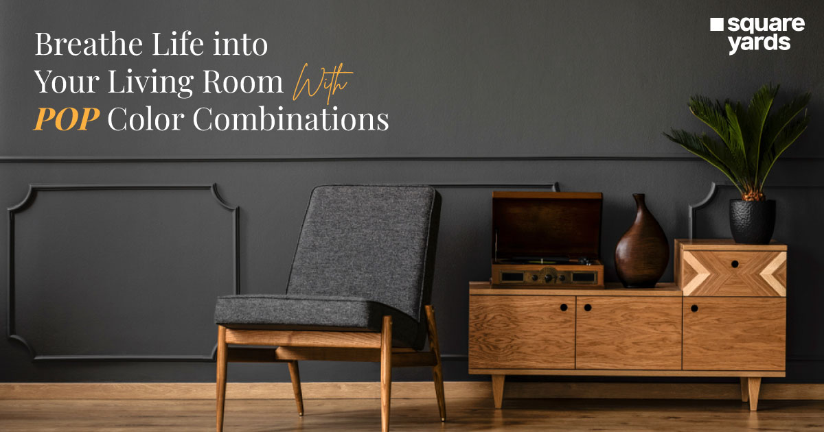
Your living room is the heart of your home, a space where you unwind, entertain, and create lasting memories. But does your current décor fail to spark joy? Does it feel bland and uninspired? If you’re craving a transformation, look no further than the magic of POP (Plaster of Paris) design!
POP offers endless possibilities for adding decorative elements like mouldings, cornices, and even entire wall features. But the true power lies in colour. With the right POP colour combination, you can completely transform the atmosphere of your living room, injecting personality, reflecting your style, and creating a space that truly wows.
This blog will explore a vibrant world of POP colour combinations specifically curated for living rooms. From classic elegance to modern drama and playful energy, 15 stunning options will inspire you. We’ll also provide tips on choosing the perfect colour scheme for your space, considering factors like mood, style, and existing décor. So, get ready to unleash your inner designer and discover the POP colour combination that will turn your living room into a showstopper!
Here are some of the best POP colour combination that you can add to your living room for some panash!
Table of contents
- White POP with Gold or Silver Accents
- Charcoal POP with Pops of Emerald Green or Turquoise
- Pastel POP Colors like Lavender or Mint Green with Bright Accent Hues
- Beige POP with Deep Green or Brown Accents
- Light Blue POP with White and Seafoam Green Accents
- Yellow POP with White and Light Gray Accents
- Cream POP with Terracotta or Burnt Orange Accents
- Deep Blue POP with Gold or Silver Accents
- Black POP with Metallic Gold Accents
- Terracotta POP with White and Olive Green Accents
- White POP with Black Geometric Patterns
- Light Gray POP with White and Wood Accents
- Brick Red POP with Cream and Natural Wood Accents
- Navy Blue POP with White and Light Gray Accents
- Multicolored Pastel POP with White Trim
- What Colours are Best for POP?
- How Do I Choose a POP Colour Combination?
- Which is Better, Wall Putty Or POP?
- FAQ’s about POP Colour Combination
White POP with Gold or Silver Accents
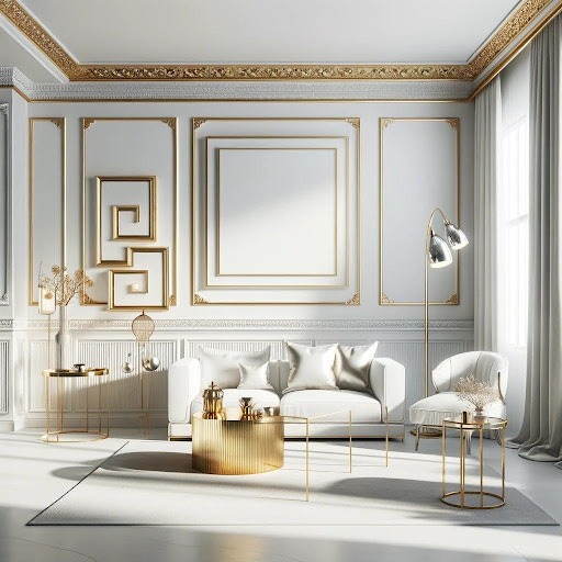
Consider white POP as your clean canvas. This allows your furniture and artwork to take centre stage while creating a feeling of spaciousness and light. To elevate the elegance, incorporate gold or silver accents. Gold trimmings on the POP mouldings or a metallic gold coffee table can add a touch of luxury. Silver picture frames or sleek silver lamps can introduce a touch of cool sophistication. This colour combination is versatile and complements various modern furniture styles, from traditional to modern.
Charcoal POP with Pops of Emerald Green or Turquoise
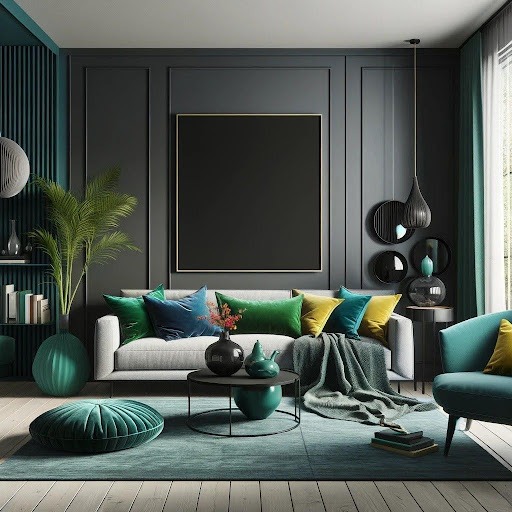
This colour choice creates a striking backdrop for your living room, instantly drawing the eye to the walls. To prevent the space from feeling too dark, incorporate pops of vibrant colour like emerald green or turquoise. Accent cushions, throw blankets, or a statement wall art piece in these jewel tones can add a touch of energy and personality. This combination works particularly well in modern living rooms with clean lines and minimal furniture.
Pastel POP Colors like Lavender or Mint Green with Bright Accent Hues

Pastel POP colours like lavender or mint green calm and soothe the room. These soft hues create a light and airy feel, perfect for injecting fun into your living room. Incorporate brighter accent colours to add vibrancy. Think sunshine yellow throw pillows, a bold red rug, or a statement wall in a contrasting shade. This colour combination is ideal for creating a welcoming and inviting space that sparks conversation and laughter.
Beige POP with Deep Green or Brown Accents
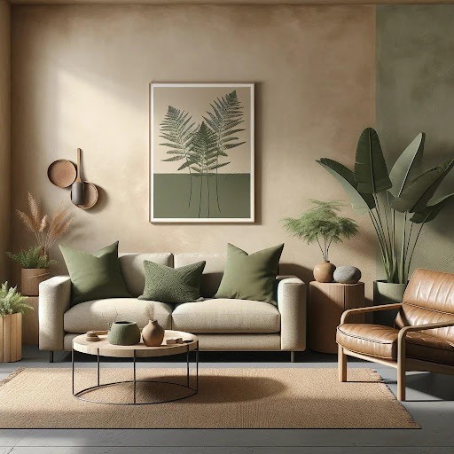
Explore the warmth of the beige POP base. This creates a sense of relaxation and complements natural elements like wood and stone. Forest green throw pillows, a brown leather armchair, or a textured brown rug can evoke a sense of connection to nature. This colour combination creates a cosy, inviting living room that promotes peace and serenity.
Light Blue POP with White and Seafoam Green Accents
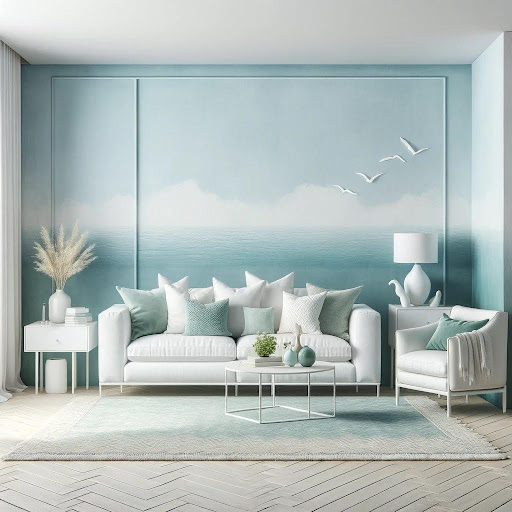
Bring the calming essence of the ocean into your living room with a light blue POP base. To enhance the oceanic vibe, incorporate white and seafoam green accents. White furniture or drapes can add a touch of light and airiness, while seafoam green throw pillows or a textured rug in a similar shade can introduce a touch of the sea. This colour combination is ideal for creating a serene and inviting living room that promotes relaxation and unwinding.
Yellow POP with White and Light Gray Accents
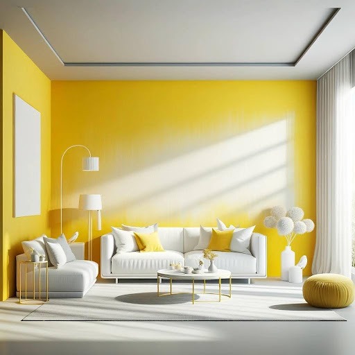
Using a yellow POP base, infuse your living room with sunshine and warmth. Incorporate white and light grey accents to prevent the space from feeling overwhelming. White furniture or drapes can create a sense of balance, while a light grey rug or throw pillows can add a touch of sophistication. This colour combination is perfect for creating a welcoming and energetic living room that promotes conversation and social gatherings.
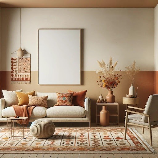
Cream POP with Terracotta or Burnt Orange Accents
Consider a cream POP base for a cosy and inviting atmosphere. To add depth and warmth, incorporate terracotta or burnt orange accents. Terracotta throw pillows, a burnt orange armchair, or a patterned rug in these earthy tones can introduce a touch of the Southwest. This colour combination is perfect for creating a welcoming and familiar living room that encourages relaxation and conversation.
Deep Blue POP with Gold or Silver Accents
Create a regal atmosphere with a deep blue POP base. This rich hue evokes power and sophistication, instantly transforming your living room into a sophisticated haven. To elevate the regal feel, incorporate gold or silver accents. Gold trimmings on the POP mouldings or a gold-ramed mirror can add a touch of opulence. A silver picture frame or a sleek silver lamp can introduce a touch of cool sophistication.
Black POP with Metallic Gold Accents
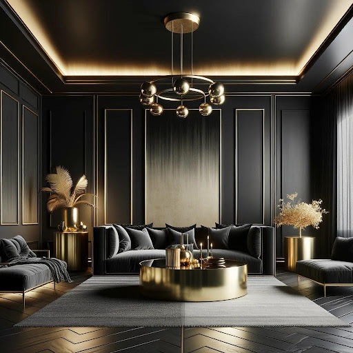
For a truly dramatic and glamorous statement, explore a black POP base. This bold colour creates a sophisticated and mysterious ambience, perfect for those who crave a unique and daring design. Incorporate metallic gold accents to prevent the space from feeling too dark and heavy. Gold trimmings on the POP mouldings, a gold-leaf coffee table, or a statement lighting fixture in a gold finish can add a touch of luxury and glamour.
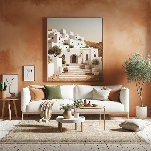
Terracotta POP with White and Olive Green Accents
With a terracotta POP base, transport yourself to the sun-drenched shores of the Mediterranean. This warm, earthy colour evokes relaxation and brings a touch of rustic charm to your living room. To enhance the Mediterranean vibe, incorporate white and olive green accents. White furniture or drapes can add a touch of light and airiness reminiscent of whitewashed houses. Olive green throw pillows, a textured rug in a similar shade, or potted plants with olive trees can further connect the space to the Mediterranean theme.
White POP with Black Geometric Patterns
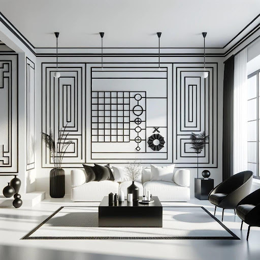
Embrace modern minimalism’s clean lines and simplicity with a white POP base. This classic colour creates a sense of spaciousness and allows the geometric patterns to take centre stage. Incorporate black geometric patterns into your POP design to add depth and visual interest. This could involve geometric mouldings, a statement wall with black and white stripes, or geometric cutouts within the POP design. Black furniture with clean lines and minimalist artwork can further enhance the modern feel. This colour com nation is ideal for creating a sleek, sophisticated living room that prioritises clean lines and uncluttered space.
Don’t miss It!
| Main Gate Design | Best Main Gate Design for Your Home |
| False Ceiling Design Ideas | Best False Ceiling Design for Bedroom |
| Two Colour Combination | Best Two Colour Combinations for Bedroom Walls |
| Window Glass Design | Best Window Glass Design for Home |
| Window Design | Best Modern Window Design Ideas |
| Rangoli Design | Best Rangoli Design Ideas |
| Wooden Door Design | Best Wooden Door Design Ideas for Home |
| Window Grill Design | Best Window Grill Design for Your Home |
| Compound Wall Design | Best Boundary Wall Design Ideas |
| Single Floor House Design | 6 Best Single Floor House Design |
| Kitchen Sink Design | Best Kitchen Sink Design Ideas |
Light Gray POP with White and Wood Accents
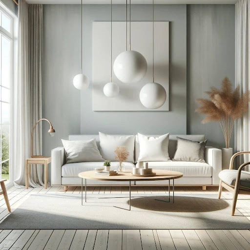
Channel the cosy and inviting atmosphere of Scandinavian design with a light grey POP base. This cool, neutral colour creates a sense of calm and serenity, perfect for a relaxing living space. Incorporate white and wood accents to enhance Scandinavian comfort. White furniture or drapes can add a touch of light and airiness, while natural wood tones from coffee tables, chairs, or flooring can introduce warmth and texture.
Brick Red POP with Cream and Natural Wood Accents
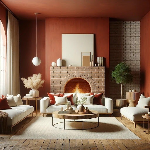
Explore a brick-red POP base for a warm and inviting living room with a touch of rustic charm. This earthy colour evokes warmth and comfort, reminiscent of a cosy fireplace. To prevent the spa e from feeling too overwhelming, incorporate cream and natural wood accents. Cream furniture or drapes can add a touch of balance and light, while natural wood tones from coffee tables, chairs, or flooring can introduce a rustic touch. This colour combination is ideal for creating a welcoming and familiar living room that encourages relaxation and conversation. Exposed brick walls or other rustic elements can further enhance the charm.
Read Also – POP Designs for Bedroom to Create a Serene Place
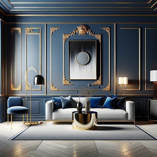
Navy Blue POP with White and Light Gray Accents
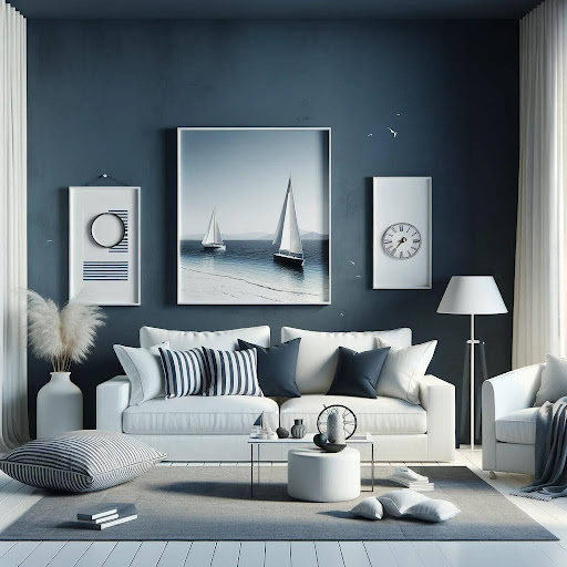
Embrace a nautical theme’s crisp and clean aesthetic with a navy blue POP base. This cool hue evokes calmness and sophistication, reminiscent of the open sea. To enhance the nautical vibe, incorporate white and light grey accents. White furniture or drapes can add a touch of light and airiness, while a light grey rug or throw pillows can introduce a subtle nod to sandy beaches. Nautical-themed artwork, sailboat models, or striped throw pillows can further enhance the theme. This colour combination is ideal for creating a calming and inviting living room that promotes a sense of relaxation and escape.
Multicolored Pastel POP with White Trim
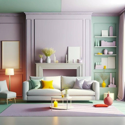
Explore a multicoloured pastel POP design for a truly unique and playful living room. This combination allows you to express creativity and inject personality into your space. The soft pinks, lavenders, mint greens, and yellows are used in a geometric pattern or colour block design with the POP mouldings. Balance the playful pops of colour with crisp white trim around the POP features and white furniture or drape. This colour combination is ideal for creating a fun, energetic living room that reflects your unique personality and encourages conversation. Remember, for successful execution, ensure the pastel colours complement each other and avoid using too many shades, which can overwhelm the space.
What Colours are Best for POP?
There’s no single champion regarding POP (Plaster of Paris) colour. Instead, the perfect choice depends on a few key factors:
First, POP itself usually starts white or off-white. This neutral base serves as a canvas for paint or other finishes.
Next, Once you paint your POP features, the colour world opens up! Here’s where your design style takes centre stage. Popular choices include:
- Classic and Timeless: For an elegant touch, white, cream, ivory, gold, or silver offer everlasting appeal.
- Modern & Bold: If you crave a dramatic statement, black, charcoal grey, navy blue, or jewel tones can deliver.
- Playful and Fun: Lighter colours, such as pastels, pinks, yellows, or greens, can add a touch of whimsy to your space.
Lastly, consider the mood you want to create in each space.
- Bedrooms benefit from calming light and cool colours like blues and greens.
- Explore warm colours like yellows and oranges to add energy to living rooms.
- To create a cohesive look, look for colours that complement your existing furniture, flooring, and wall paint.
- Darker colours can visually shrink a room, so use them cautiously in smaller spaces.
There are no strict rules, so if a particular colour sets your heart ablaze, don’t be afraid to use it!
How Do I Choose a POP Colour Combination?
Choosing a POP colour combination can be fun when personalising your space. Here are some steps to guide you towards the perfect palette:
Understanding the Room’s Mood
Think about the atmosphere you want to create in each room. Bedrooms benefit from calming colours like light blues or greens. Warmer tones like yellows or oranges can add a touch of energy to living rooms.
Consider white or cream POP with gold, silver, or black accents for an elegant feel. This creates a sophisticated and enduring look.
Want some drama? Embrace black or charcoal POP with pops of bright colours like turquoise or emerald green. Play with contrasting textures like matte and glossy finishes for added impact.
Let loose! Use pastel POP colours like lavender or mint green with pops of brighter hues. The POP design’s geometric patterns or whimsical details can add to the playful feel.
Creating Balance with Color
Limit your colour palette to three main colours to avoid overwhelming the space. One colour can be dominant for the POP itself, another for the walls, and the third for accents.
Look for complementary colours on a colour wheel – they sit opposite each other. These pairings create a vibrant and dynamic effect.
Colours that sit next to each other on the colour wheel create a harmonious and calming scheme. This is a good option for creating a serene atmosphere.
Matching Your Existing Decor
Look for colours that complement your existing furniture, flooring, and artwork. This ensures a cohesive and unified look throughout the space.
Embrace Experimentation
Before committing, paint swatches on the wall and see how they look with your POP design. Online visualisation tools can also help you see different colour combinations in your space.
Which is Better, Wall Putty Or POP?
Wall putty shines when creating a strong and long-lasting foundation for your walls. Made with cement, it forms a powerful bond and protects your walls from moisture, even in damp environments. This translates to a smoother paint finish that resists flaking. Wall putty is also a master of subtlety, applied in thin layers (1.5mm to 3mm). It’s a versatile champion, working wonders on interior and exterior walls. However, remember that wall putty takes longer to dry and isn’t ideal for creating fancy mouldings or decorations.
Speaking of speed, if fast decor is your priority, POP comes to the rescue. It sets quickly, allowing you to finish projects faster. POP truly embraces the artistic side, letting you create beautiful mouldings, cornices, and other decorative features that elevate your space. It can also be applied in thicker layers (5mm to 12mm) than wall putty. However, POP has its weaknesses. It’s less durable than wall putty and prone to cracking and damage. Plus, POP absorbs water easily and can deteriorate outdoors. While it dries fast, achieving a smooth, paintable surface with POP might require extra sanding.
So, consider your project’s needs if you want to know which one to choose. Remember, climate also plays a role. In humid areas, wall putty’s water resistance becomes even more valuable. Budget can be a factor, with wall putty generally being the more cost-effective option.
At The End
We’ve just scratched the surface of the incredible potential of pop design. But how do you choose the perfect pop colour combination for your space? This is where we come in! Our platform is a treasure trove of design inspiration, bursting with trendy pop colour combinations and design ideas. You will find many options to spark your creativity, and we also offer expert tips and tricks to guide you through the selection process. So, ditch the bland and embrace the bold. Visit us today and discover a world of POP design inspiration. We can’t wait to help you transform your living room into a showstopper!
FAQ’s about POP Colour Combination
Q1. Which colour is best for pop?
There’s no single “best” colour for POP; it depends on your style and the room.
Q2. How do I choose a pop colour combination?
Consider the mood you want to create and complementary colours on a colour wheel.
Q3. Which pop is best for the living room?
For a living room, bold colours with contrasting textures can add drama.
Q4. Which is better, wall putty or pop?
Wall putty is generally more durable for walls, while POP is faster for creating mouldings.
